Thursday, November 20, 2014

Carlo Scarpa, Musee D'Orsay, Jewish Museum

Carlo Scarpa
Canova Museum, Possagno

Scarpa said, describing his endeavor, “Light was the problem I faced in improving the gallery: I had to deal with sculptures, not paintings, and not marble or wood sculptures but casts made of plaster, an amorphous material that is sensitive to bad weather and needs light, and therefore must be under the sun. And when the sun moves around a sculpture, it never has a negative effect…”

https://www.youtube.com/watch?v=6grSXNoz3YE


Carlo Scarpa was brave enough to display white plaster sculptures on a matching colour background. This idea was very controversial. The sculptures bath in the sunlight, shadows divide the sculpture whom the whiteness of a background. Dramatic lighting, illuminates the sculptures like actors on the stage. The sun light brush the walls in different angles through out the day. He said that his cubic windows - "Catch fragments of the sky" Light bounces perpetually backwards and forwards.


Almost all plaster sculptures by Canova are originally covered with little dots (small points) as they were "draft" models for future marble sculptures. Dotting helped the Sculptor to identify and copy the shape. In a white background go the museum, the dots stand out and underline the shape of the sculpture.  


The Three Graces sculpture is divided from the rest of the collection. It is places in a specially added part, there it is surrounded by nature, water, sky and sunlight. 


The fog was introduced into the Museum space. I think it is a very clever idea to catch the light with the help of water, to turn the light into an"object". The whole space was transformed, it gained a magical and dreamy look.


Musee D'Orsay, Paris

The building was originally a railway station. By 1939 the station's short platforms had become unsuitable for the longer trains that had come to be used for mainline services. After 1939 it was used for suburban services and part of it became a mailing centre during World War II. 
The building was listed in 1978. Museum is known for a huge collection of Impressionists paintings and Art deco objects.


Additional gallery spaces were added in the main hall by introducing 10 dark rooms. 
Window in the cafe on a photo below.


This is one of the exhibition rooms. I like that the furniture is presented in a context of a room. 


Libeskind
 Jewish Museum, Berlin

The whole museum is an attempt to represent the jewish history with the help of space and architecture. Broken lines, no straight angles, edgy shapes of windows and rooms.
The room with a small triangular window represents the emotional space of a prisoner in the camp.


This is the first thing the visitors see entering the museum. I think it is a very lovely place to rest and have a cup of tea after visiting the mind-blowing and claustrophobic museum space. In this case, darkness and claustrophobic feeling is positive as that what the architect wanted the visitors to feel. 
The museum itself is absolutely huge, learning rooms, all sorts of interactions with the visitor, journey through the space. It was so bid and expressive that i felt dizzy and a bit depressed after the visit, it is the most heavy space I have ever been to.


This is an Interior of Kaiser Wihelm Memorial Church in Berlin
Walls are made of small coloured bricks.
Feels like Space, like an evening sky, blue colour pacifies. Might be very useful for future museum.


Wednesday, November 19, 2014

Tuesday Workshop (18.11.2014)

The task was to create an artefact for the future museum. We were divided on little groups of 3-4 people. My group decided to build models of modern computers, bearing in mind that they will be seen as dead and useless, old-fashioned objects in the future. We knew that we would have to swap the artefacts, so with our simple idea we wanted to challenge the other group.


We were given a model of a design object that is exhibited in the Design Museum at the moment. It is a structure that can be assembled in many different ways. In the Design Museum it is placed on a pedestal, visitors are not allowed to touch it. We are familiar to Foucault's ideas, so we decided to take his point of view into concideration and imagined the scenario where the museum of the Future evolves itself by the help of visitors, rather then curators and designers of the exhibition. 


We decided to allow visitors "play" with the design object, built structures and experiment with shapes and forms. The object exists in the real world, so it always interacts with the light. We decided to build a space where the visitors can construct something and watch how the image of the structure  changes through the day time. The lamp - symbolises the sun. It moves across the room . In 10 minutes it makes a full circle. Here is a quick sketch of the idea.


The interior space is very curvaceous as we wanted to underline the idea of cycle and continuation, perpetual repetition of ideas.


Monday, November 17, 2014

Museum of Childhood


The architecture of the museum is very alluring. I am always fascinated to see how the old buildings are transformed to meet the modern meeds. In this case, a new entrance was added. It looks playful and relevant. I looked inside, the museum was filled with children and parents. I saw a poster near the entrance, offering a perfect location for celebration children's birthdays. They sold it to me and I decided to come back with my little sister.


The interior of the Museum of Childhood did not impress me at all. It is too dark and gloomy. Despite the height of the ceiling, the space looks small and claustrophobic. We decided to have a look at the artefacts. The displays are horrible. Glass boxes. Most of artefacts are poorly lit, and not exiting to look at. 25 percent of the artefacts are modern toys. 


Half go the main hall is occupied by a cafe, seemed like the whole museum exists to attract the visitors into a cafe. Because of the Area (Bethnal Green) and uninteresting context, majority of people visit the cafe before leaving the place. 


The museum is very empty, seems like it was made for grown ups to remember their childhood. Kids are more interested in running around rather then look at the uninterestingly presented old toys. 


There are few tables with toys for kids to play, but the toys are dirty, overused, some of them are simply broken. My sister loved the mirror installation because of the little lamps that changed the colour, but very soon she became bored and sleepy.


This is one of the artefacts - a hundred years old doll house. It looks like a Ghost house, scary, lifeless. The question is, is it something that the child would enjoy seeing? The lighting of a house is horrible, it adds a ghosty feeling to the scene.


This is a very poor attempt to present the toys. Dark, messy, scary. 


In conclusion I would like to say, that it was the most poorly designed museum I have ever been to. If you have a kid whom you want to punish for bad behaviour, this is a perfect place for you.


Tuesday, November 11, 2014

"V and A". Ideas From the Lectures


General Information on - "V and A"

V and A is my favourite museum in London. I appreciate the their collection of renaissance sculptures and the way they are presented. It is not clustered, so I can always find a place to sit and draw. Epochs and Cultures are divided on sections, I always know where to go. The building itself is like a big box of beauty and curiosities. In many rooms the day light is not blocked. The public Garden with a fountain is very enjoyable. I already talked about the importance of the public spaces for museums. 


I love the museum's approach towards contemporary art and design. It perpetually work with new ides and materials. For example, The power of Making exhibition was just brilliant, very open minded and innovative.


 The Design Festival was curated in a very clever way. "V and A" located all the objects from the design Festival in different rooms of the building, encouraging people to walk through the gallery space, and discover something new to themselves.The fact that I am positive about it, does not mean that other people feel the same way. I remember, some of the visitors were very upset because they had to walk through the whole gallery, while they came specifically for the Design Festival. Well, this is how "V and A" deals with new design, inviting it, blending it to the existing collection. 


The Lectures

It was a tiring day, 7 speakers were invited to the lecture, they rose and answered many interesting sand important questions, but the amount of information was overwhelming. Here is my attempt to rethink and underline the ideas that appeared to be the most exiting and useful for me. 


The first Speaker talked a lot about Foucault's practice. Technologies of the self. Foucault believes that it is very important for individuals to find themselves, find their limits, their aims. He sees a museum space as a resource for personal development, from where information and knowledge can be received. Every person see the museum differently, they are interested in objects that somehow reflect themselves. The lecturer, in a private talk, pointed out that from Foucault/s perspective, museum's future should not be artificially build and colonised. Museum can be compared to a child. The child should not be told what he likes and what should he do with his life, a child should be listened to and supported. His future should not be colonised but given a freedom to evolve in its own way A child should explore what he likes to do, etc.  Museum should also be set free, and develop through experiments and innovative ideas, I will repeat myself, without predicting of how it MUST look like.

The word MUSEUM appeared from the word Muse. (a place where the inspiration lives) Museums changed their focus, they used to be for objects, now they are for people. Museums think of the best ways for visitors to walk through their space so the information unfolds clearly and comfortably in front of people's eyes. Comfortable cafes, public spaces, enough space between the artefacts, seating, toilets, helpful staff. The designers even create the line of drama for a gallery or museum space. 
Museums try to attract people with the help of Tv adverts and posters in the street and even in the tube. Museums changed their policies, majority of them are free of charge. But the cafes inside galleries and museum are focused on the middle class, the prices are not affordable. 

Museum's biggest complain is the lack of space, so biggest part of the collection is stored in the basement, in closed rooms, with no public access. From my point of view there are 3 solutions for this problem. My solutions are bold, but worth to considering.
1. Revalue all the items, museums and galleries are prone to hoarding unneeded stuff. Very likely that some of the objects in their collections are not worth of keeping. So it should be given to people through auctions (for example) or returned to the place where it was taken from (Greece, Egypt, Africa). Otherwise there will never be enough galleries' and museums space for them.
2. Create an online catalogue, provide better access for the community. (Make better cabinets and storages, so they will be efficient and take a reasonable amount of space.) - this is a good idea for a project, especially for DRS 2 (they are working with the display of collections)
3. Collection can travel around the world. Collections can be exchanged. A building for permanent collections should be built in every country. They will provide a safe place for "Art Migration"

An example of an engaging exhibition is here (by Lis Rhodes)

Monday, November 10, 2014

Shadows, Chelsea Lecture Theatre

The Evening Lecture

Usually, during lectures I sit in the middle, right in front of the screen. But this time I relocated myself into the left side of the lecture theatre. I have discovered that there is a big difference between sitting on the front row and on the left side in the middle. Fist of all, the lecture room looks different, it looks bigger and more spacious. On the from row I would pay a lot of attention on the screen, but on the left side, I have discovered that I payed more attention on a lecturer. As you can see on a sketch, the lecturer's table sits in a corner, facing the left side of the room, so the lecturer is prone to give more attention to the audience in the left row. (In black are the area that the lecturer usually see) Just by changing my position in the space the monologue, somehow turned into a dialogue, and the images on the screen partly lost their importance.


Because I saw the lecture from the other angle, I discovered a fascinating shadow on a wall that I have not noticed before. The shadow distorted the girl's silhouette. Her hands seemed to be massively enlarged. The lecturer used her hands a lot during the presentation, she drew with hands on the air, showed shapes and expressed her emotions. I love the effect of enlarged hands, in a tactile world of future Design Museum, i can definitely see it in use.


Saturday, November 8, 2014

The British Museum + London Transport Museum

 British Museum

Overview

The main hall is very spacious. It connects all the museum spaces and collection together by providing the access to all of the rooms. There is a library with special book collection in the middle of the hall. The ceiling is high, the hall is filled with the natural light coming from the top. 
The hall is big enough to contain an informational desk, 3 cafes, 2 shops. There are always contemporary art sculptures in the hall. It is often used for the educational purposes. There are lots of students and tourists. Personally, I find the main hall space very confusing. The construction in the middle does not allow to see the whole space, so, very often people are lost, being no able to understand where is the exit from the Museum.


Interviews

I found the room with clock mechanisms to be very fascinating. The display in the middle attracted my attention by its simplicity and functionality. It protects the mechanism, does not ruin the view. The structure is made of steel and glass. Everything is on the eye level, The screen and a table with drawings visually explain how the mechanism of the clock made and where it is used.
I decided to interview people who were in the "clock room". 
A young boy was attracted by the shadows and movements in the clock room. He told me that he lived very close to the museum and the last time he had been there was during his school years, approximately at the age of 10. This visit brought him a lot of childhood memories. 
Two young girls, were the students of UCL, they decided to go to the museum on their lunch break. They were not looking at something in particular, came by because of the general curiosity. 
A Brazilian man, came to the museum to see the egyptian mummies. He underlined that the"clock" room is his favourite so far, and that he is very happy that all the clocks are working.


Following people

An old Lady with red hair confidently entered the space of the main hall. She wanted to go to the informational desk but then she changed her mind and decided to leave the museum, but then she has changed her mind again and came back to the main hall. I was waiting for 10 minutes, the lady was just standing near the entrance, probably she was waiting for someone. After 10 minutes she walked into the shop, bought something and walked away.
A couple with big rucksacks confidently walked to the informational desk, then they walked out of the gallery with the same confidence. 
An old man with grey hair and  a suitcase approached the map. He spent 2 minutes looking at it, then he went to the right side of the building, near the entrance to the "library space" he changed his mind. He walked back, looked at the map again and went to the left, i lost him in a crowd. 
To ladies entered the main hall, talked to a member of staff, then they walked up the stairs and stayed in the restaurant for lunch. 
I was not very lucky with these people, they seem to be very undeceive, perpetually changed their mind. I wonder, if they were confused by the space of the main hall? 
A woman in her 30th in a green coat went to the second floor. Her destination was an Egyptian room, she spent a lot of time there, she looked at the artefacts and read the information carefully. She did not have a notebook, she did not take any photos. Then she went to the left, but majority of artefacts she stopped near by were on her right side. She skipped the Greek room. A composition of statues attracted her attention. Then she went downstairs, bought a muffin in a cafe and walked away.
I have underlined for myself, that the right side of the room and the first room of the exhibition are more likely to be examined carefully by visitors. 

The Museum of a Future

At 14:30 a group of dancers made a performance in the main hall. The dance performance was inspired by the space of British Museum and how people move through it. The dance was a part of the project. The aim of the project is to explore and propose ideas of how the future of the British Museum can look like. Museum of the future, icon dance. The project is supported by Arts Council of England. I think is it very related to our project. 


The Icon Dance


London Transport Museum.

I was not particularly exited about the museum at first, but when I entered a museum space it left a really good impression on me. The space was well organised, information was clear. The museum was refurbished about 5 years ago and it looks very modern, the newest technologies and ideas are used. 
The atrium with 25 meter high ceiling is a good place to decide where to go next. The atrium in London Transport Museum, just like the Imperial War Museum builds up its exhibition spaces around the main atrium. 


The Museum allows people to touch all life-size models and real objects (real buses and cabs). It contains all different kinds of models, original drawings of a design. Projectors build a narration using the whole length of the room. 
                            

The museum thought of a trip around the building that will fully and chronologically reveal the information in front of the visitor. The exposition is supposed to be viewed from the top floor. Here is a map with a journey visitors are recommended to undertake. They added a game element to the journey, visitors should put a stamp on a special piece of paper in each room they visit. I think this game is very good for kids and young visitors. The last room of the exposition commemorated to the ideas of how the transport will operate and look like in the future. I noticed that the rooms with future projects and latest works are always in the end of the exhibition. I am always tired in the end, and the most interesting and exciting room (in the galleries the curators usually put the best works in the end) is half seen and half understood by me. I don't understand why do majority of the exhibitions should start in the chronological order, why not to start it from the end? Why not to go further into the past, rather then back into the future.?


I love the way the movement of transport in shown on the video. Moving lights show a very dynamic image of a city on the move. As you see, all the windows on the ceiling are closed, the light from the outside is completely blocked. The ceiling is lit with blue lights (filters). The blue light gives a futuristic touch to the museum's atmosphere.


The entrance to the Transport Museum


Interview with a manager of the Transport Museum


I was curious about the previous function of the museum building, it looked like a railway station to me. I asked the question to one of the people who work in the museum, and they called a manager who came to meet me in 5 minutes. He told me that the space was used as a flower market before. It was lit both sunlight and it was very spacious, and grand. ( In the same style King's Cross station and Brighton station were made)


He said that the building is protected by the English Heritage and they had lots of constrains while working with the gallery space. For example, the main atrium was not allowed to change or divide ob several floors. The building should have keep the face of the architecture. 
It is a very fascinating story, and it is very relative to the Design Museum project.


Friday, November 7, 2014

The National Gallery + The Million Mask March

There was a "Million Masks March" in London on the 5th of November. I participated in the march and discovered for myself many interesting things about the city space. 
1 - I have seen the city from a completely different perspective. I have seen the city from the middle of the road. I have seen the city through the eyes of a participant of the demonstration, rather then through my "own". The city looked different, the shops and restaurants were closing down as soon as we approached them, the movement on the street was paralysed, people were stuck inside cars and busses. People from the street filmed us.
2 - The architecture of a crowd. It is not just a massive number of people who get together. People of the crowd are divided into small parties: friends, individual activists surrounded by followers, single people, couples, etc. There were leaders (not even just one leader) with loudspeakers who would speak out the decisions of the crowd of where to go and what to say.
A group of people on the photo lighted up the sparklers. Seems like the light connects the party together, forms a unit.


3 - the movement of the crowd (see the map below) showed me where the most important in spots of the city (the Parliament square, Buckingham Palace, the building of BBC, Oxford street, Trafalgar square). 
4 - Policemen were blocking the streets, creating some kind of alive wall. Lines of Policemen (thunderheads of them) would separate the crown from the space of a Parliament square, block the streets preventing the crowd from moving in particular directions. They were very fast, they calculated the rout of the march and wait for people in the end of the street, so the crowd had to make new routs and device new ways of getting wound the city.


National Gallery

I though a lot about the entrance to the gallery, how it is constructed and how it affects the visitors' perception of the gallery experience and the gallery space. The entrance to National Gallery is above the level of the square. The entrance hall contains: a shop, a waiting area, an informational desk with maps and a ticket office.  
The main staircase is constructed to give people a choice which direction to go. 13-16th Century art works on the left, 17th century at the front and 18-20th century on the right. However, from my observation, majority of people went straight ahead. Despite the the entrance hall provides visitors with all the information and space needed in order to be prepared for the visit, quarter of the people look at the map and think bout where to go right in the middle of the staircase.
The fact that the majority of people choose to go straight means that all of them start their National Gallery visit with a room commemorated to a 17th century religious paintings. Did the exhibition designers of the gallery wanted visitors to start with that room? From my point of view the first room should provide visitors with a clear visual information. Signs, maps, overview of the art works. The first room should contain paintings from each section, to make it even more clear where to go.


Observation

I have chosen this spot (photo above) to observe and count people. After 20 minute exercise i discovered that out of 305 visitors (newcomers) 267 went straight ahead, 26 to the right and only 12 to the left. 79 Visitors hesitated in the middle part of the staircase.


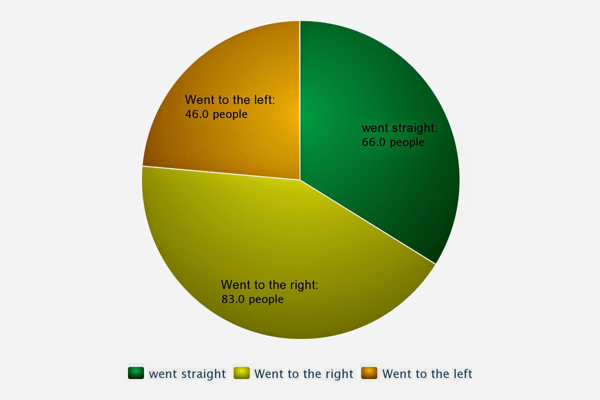
I also spent 18 minutes in the 1st room ( the one that 267 people from the previous experiment entered) Out of 195 people, 66 went straight, 83 to the right, and 46 to the left. 


Follow the people

When I followed people, I was trying to analyse their movements and their way of dealing with  space. I payed attention to their media preferences ( photo, painting, installation etc) and how they interact with the artefacts. I was trying to see the gallery through their eyes.
My first "victim" was a girl of my age. She came to the gallery by herself. The girl has chosen to go straight. In the first room she looked at all the paintings carefully, she moved around the room in an antilock direction. She has chosen to go to the room on the left from the entrance. She made a circle around the next room, looking at all the paintings, reading only the name of the paintings and the artists. Then she went to the right and from that point she would always choose to go to the right. Next 2 rooms were carefully examined, after that she would only stop near the paintings on her right. She made a circle and ended up in the first room. Here is a sketch of her movements. 


I followed an old couple. They viewed the paintings separately but they always intersected near the works they both liked and discussed them. Despite the "separation" they would always be in the same room and move to the next room together. They did not have any particular pattern of moving. They could look at the work on their right, then they would go to see the work on the far left end of the room, and then they would come back to the painting they have just seen.